Brand Strategy
Web Design
Development
SEO Strategy
Making a tattoo studio findable for the styles that actually set it apart

ART Quartal Tattoo's Stuttgart studio site, redesigned and rebuilt from scratch on Duda after a previous designer had already tried and failed to fix it. A specialisation-first SEO and content strategy — built around the studio's actual work.
Impact
4,500+
Visitors to a site that, a year earlier, wasn't ranking for anything
40+
Qualified inquiries generated monthly through organic search alone
Summary
Objectives
- Make ART Quartal findable for the specific styles that define the studio: cover-ups, abstract, photo-realism, rather than competing for generic, high-volume search terms
- Rebuild a site that had already failed once under a previous designer into a fast, structured foundation
- Turn organic visibility into actual bookings, not just visits
Key skills
- UI/UX Design & Website Rebuild (Duda)
- Local & Niche SEO Strategy
- SEO Content Strategy & Copywriting
- Brand Concept Development
- Conversion-Focused UX
The clients who wanted them most couldn't find them
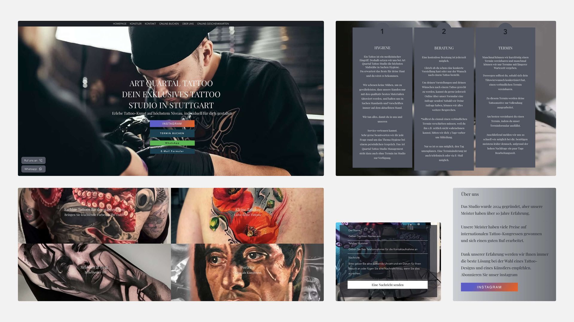
A previous designer had already attempted a fix and failed: the site that resulted was slow, dated, and unstructured. But the deeper problem was visibility: despite the studio already paying for SEO, the site wasn't ranking for anything.
The strategy behind that spend had aimed at the broadest possible term "tattoo studio Stuttgart", a category ART Quartal was never going to win against every generalist studio in the city.
Meanwhile, the clients most likely to book — people searching specifically for cover-up work, abstract pieces, or photo-realism — had no way to find a studio that specialised in exactly that. The business was invisible for the searches it was actually positioned to win.
Art Quartal website before redesign
Rebuilding around specialization, not the broadest possible keyword
Instead of continuing to compete for generic category terms, the content and keyword strategy was rebuilt around what actually made ART Quartal different: cover-ups, abstract work, photo-realism, paired with ongoing monthly SEO work rather than a one-off optimisation pass.
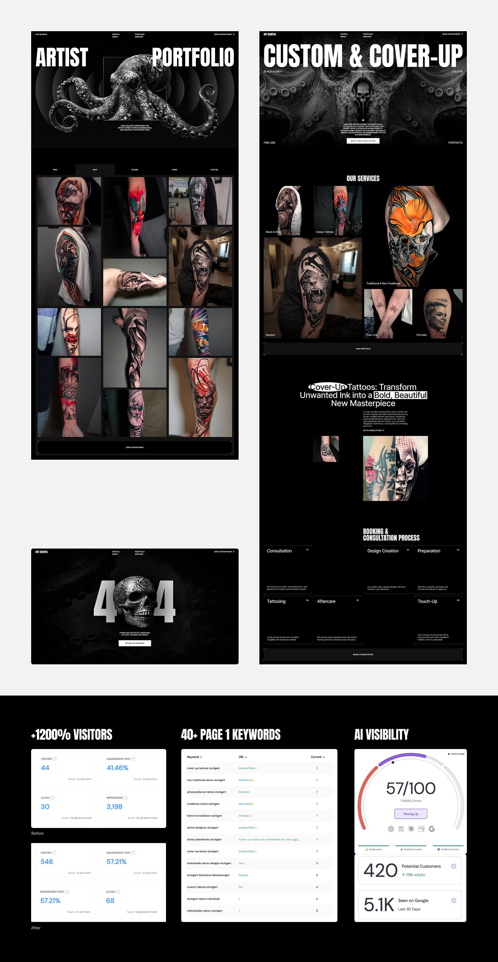
A year in, that shift shows up directly in rankings: 40+ keywords now place on page 1 of Google, none of which existed when the studio was only chasing the term every competitor was already fighting over.
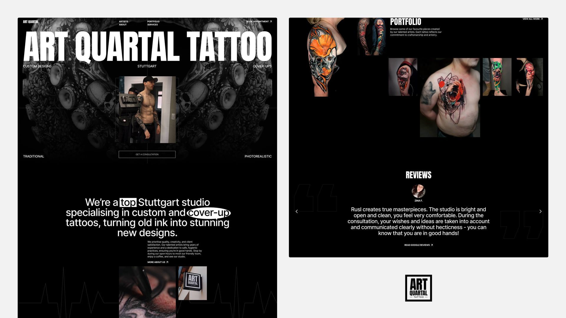
Homepage snippet & proposed logo
Giving the studio a visual identity worth ranking for
The previous site had no real concept behind it, just a random layout. The rebuild introduced a dark, ink-inspired octopus motif across the whole site, sparked by a piece of graffiti near the studio that read as unmistakably tattoo-adjacent.
That one idea became the visual throughline for the entire brand, not a one-off illustration.
A distinct identity does more than look better — it gives a niche studio something memorable to be found as, not just found for.
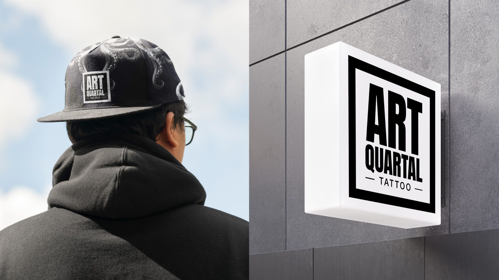
Branding in context
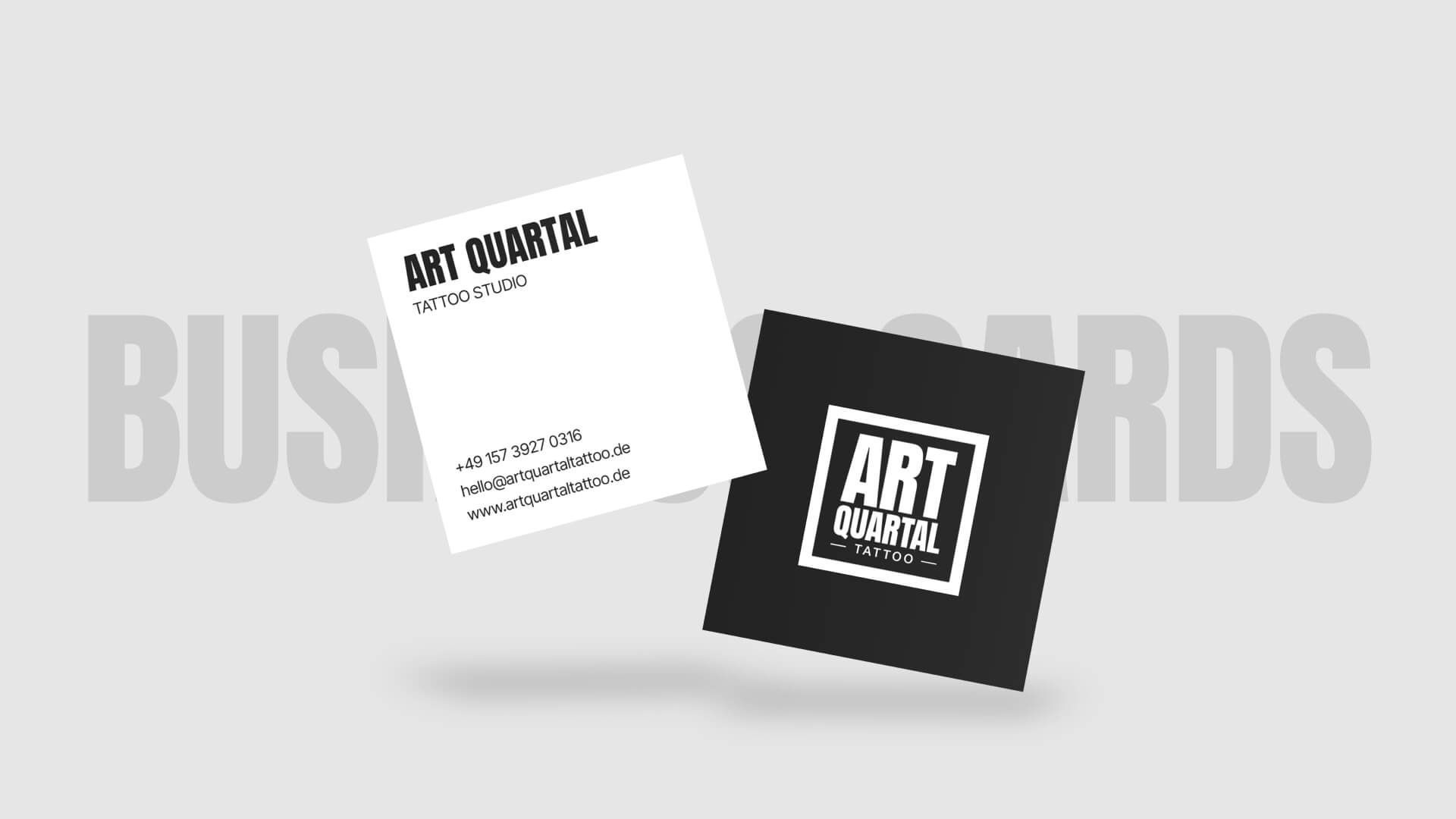
Business cards design
Business cards design
Turning visibility into bookings, not just traffic
Ranking for the right searches only matters if the site then makes booking obvious. The rebuild focused on clear structure and easy navigation, plus a direct WhatsApp click-to-call option so a visitor could reach the studio in one tap instead of hunting for a contact form.
The numbers back this up: 1,243 clicks through to the booking system and a 60.61% engagement rate — traffic that's actually converting, not just arriving and leaving.
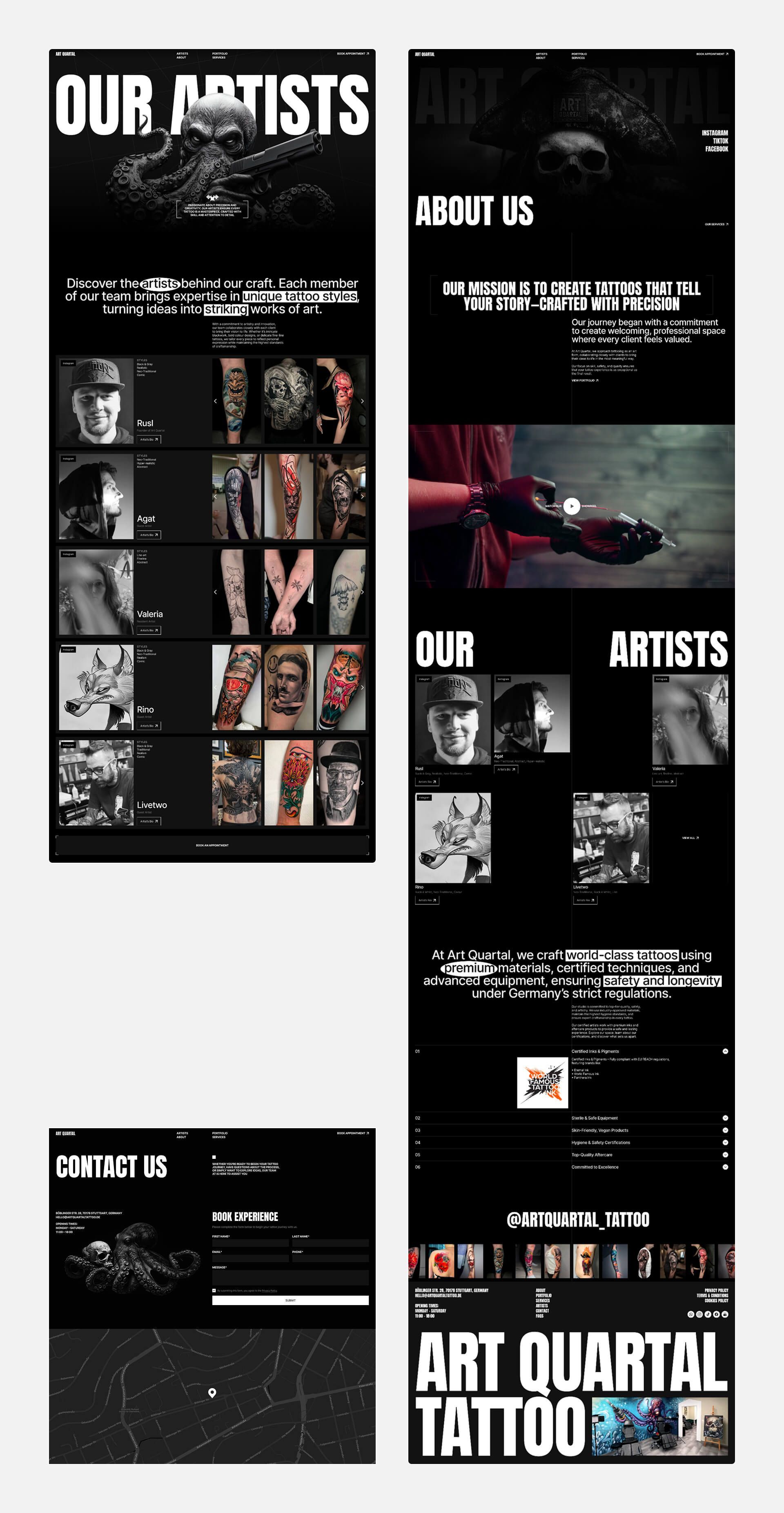
Innder pages: artists, about, contact
Portfolio, services, 404 and SEO stats
Portfolio, services, 404 and SEO stats
Key Takeaways
01
SEO has to be considered from the outset, not bolted on afterward.
ART Quartal had already paid for SEO before this project started, and it produced nothing — because it was never built into the site's structure or content strategy from day one. Treating SEO as a launch-phase decision, not a post-launch add-on, is what made the difference here.
02
A strong concept does more for a brand than incremental design polish.
The octopus motif came from a five-minute brainstorm sparked by graffiti on a nearby wall, not a long creative process — but it gave the studio a single, ownable idea to build every page around, which generic "clean and modern" design choices never would have.
03
Visibility means nothing without a clear path to book.
Ranking on page 1 only pays off if the site then gets out of the client's way — clear structure, obvious navigation, and a one-tap way to reach the studio turned organic traffic into the 40+ monthly inquiries above.
Let’s do this
Whether you're hiring or you've got a project, get in touch.
You didn't land here by accident. Whatever brought you, get in touch and let's figure out the next step.