Beauty
Branding
Web Design & Dev
Online Course
Giving Lashboss Online a brand and platform to sell premium beauty training

Lashboss Online's brand identity, landing page, and course delivery platform — designed and built solo, end to end, on Tilda. Four weeks from idea to a fully operational platform, including a 5-day build turnaround once direction was locked, replacing a dated site with no visual identity and no way to sell or deliver training online.
Impact
300+
Site visitors in the first month, up from a business with no online presence to sell through
12
Paying students converted in the first month, and are still climbing

Summary
Objectives
- Replace a dated site that undersold a premium training business with a brand and landing page that actually looked premium
- Give the client a working way to sell and deliver online courses, where no platform existed before
- Take the project from idea to a fully operational platform in four weeks, solo
Key skills
- Brand Identity
- User Experience Design
- Landing Page
- Tilda Development
- Basic SEO Setup
- Platform Architecture
- Collateral Design
Nothing to build trust with, and no platform to sell through
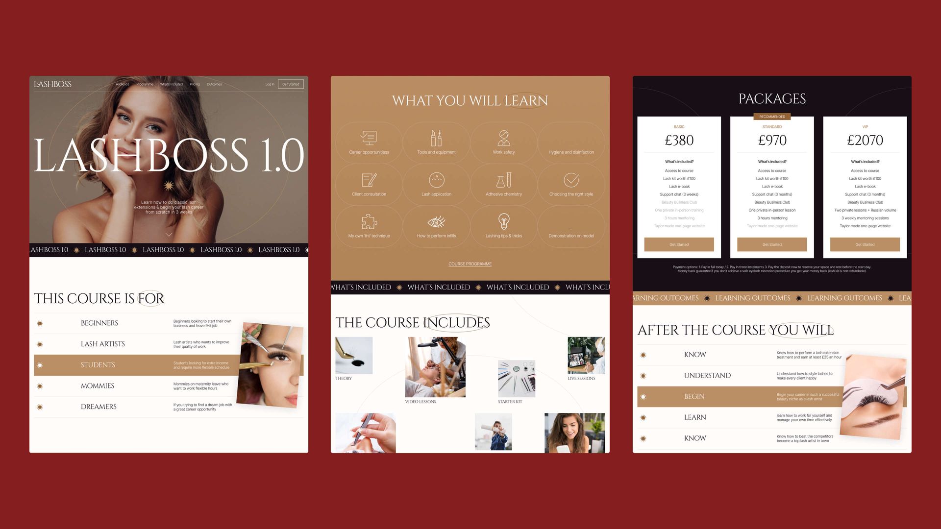
Lashboss Online had a reputation for premium lash training, but the website undercut it: dated design that didn't reflect the quality of the training, and no real visual identity to build trust with a prospective student comparing options. The existing brand's color and visual direction actively worked against a premium positioning rather than supporting it.
More fundamentally, there was no way to actually sell or deliver a course online — no package structure, no student access, no platform at all. The business could describe its training but had no way to run it as a digital product.
Lashboss website before redesign
Rebuilding the brand's direction, not just refreshing it
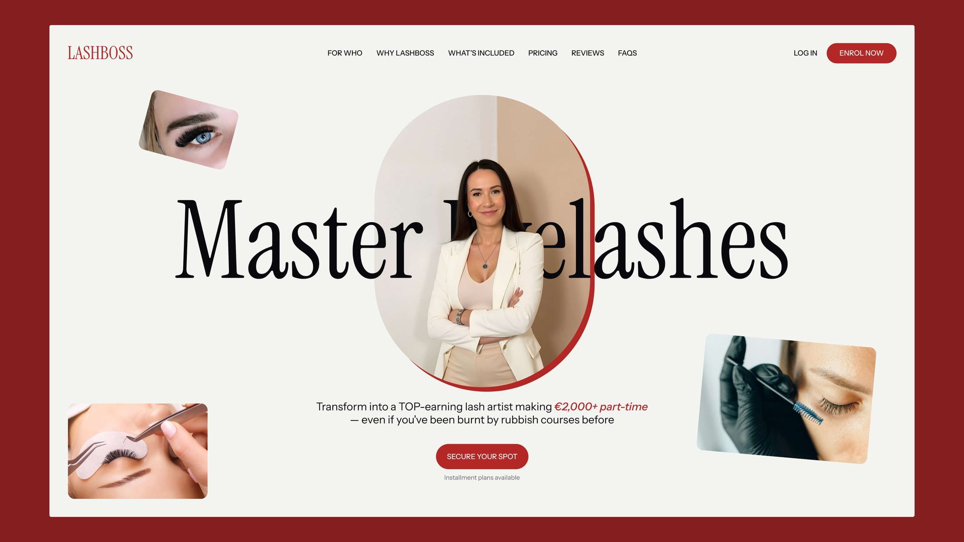
Reviewing the existing brand made clear that a simple refresh wouldn't be enough — the colour palette and visual language weren't reading as premium, and didn't appeal to the target audience the training was actually trying to reach.
The fix was a new, bold identity built around a distinctive red palette, with elegant typography and brand elements designed specifically to signal quality and credibility.
That meant treating this as a brand reset, not a polish pass — a bigger scope call than a typical landing-page project implies.
Logos, palette, and core brand elements were reviewed and rebuilt quickly, then rolled out across the new site rather than left for a later phase.
Alternative hero section
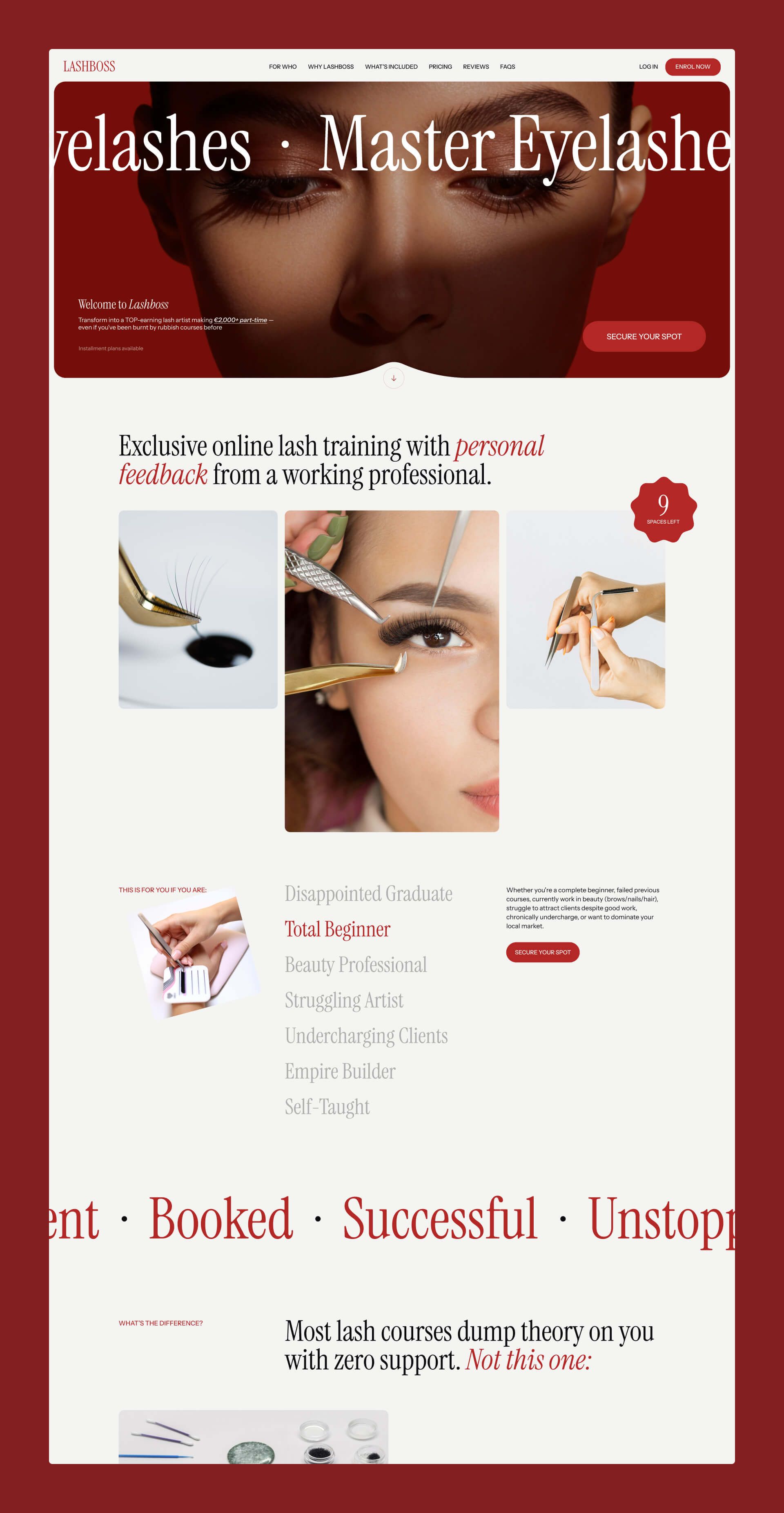
Designing a landing page built to convert, not just describe
The new landing page was structured around multiple training packages, each with its own clear value communication, rather than one generic pitch for the whole business.
Interactive animations were used throughout to keep the page feeling premium rather than static, matching the new brand identity rather than sitting apart from it.
Every section — from the hero framing to each package's breakdown — was built to move a visitor toward a purchase decision, not just describe the training on offer, so the page's structure did the selling rather than the copy doing it alone.
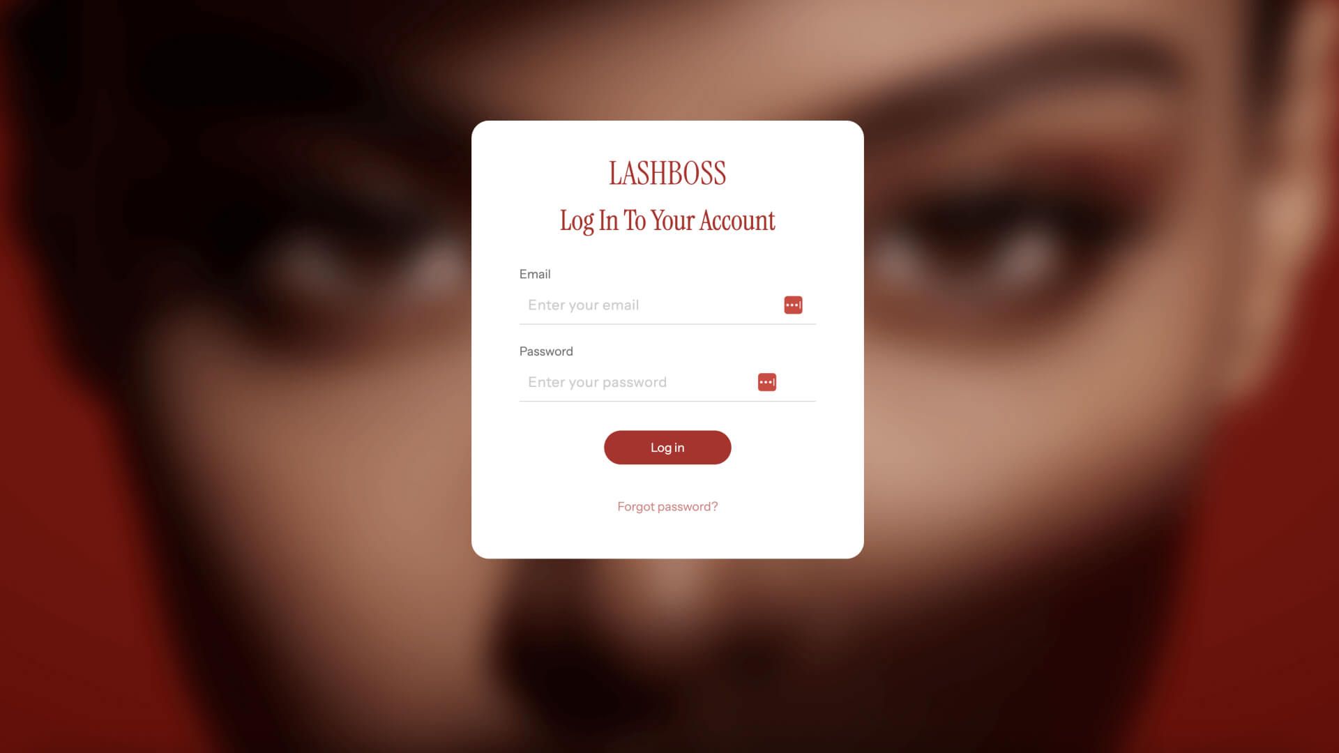
Student login page
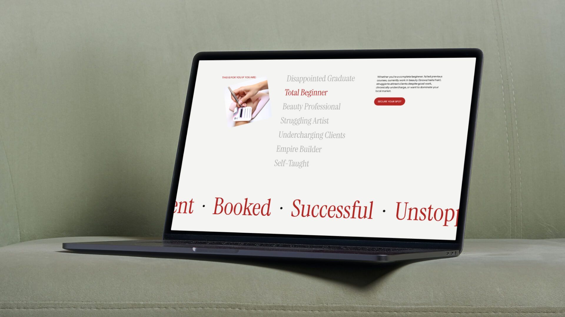
Interactive 'Who is it for' section
Interactive 'Who is it for' section
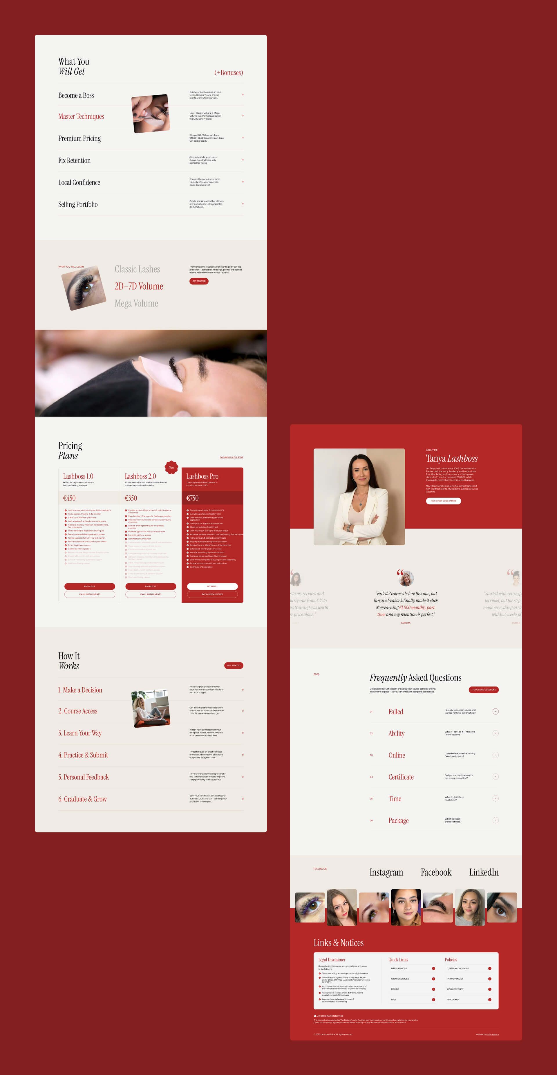
Going beyond the no-code platform's defaults to build a real course product
What looked at first like a simple landing page build turned out to require a fully operational course platform underneath it — multiple packages, student access, and content delivery from day one. Tilda's default toolkit didn't cover all of that natively.
So the build went beyond Tilda's stock capabilities, integrating reliable third-party tools to close the gap — proof that a no-code platform's limits are a starting point, not a hard ceiling, as long as what you plug in is dependable.
Landing page first sections
Remaining page elements
Remaining page elements
Key Takeaways
01
What looks like a simple landing page can hide real platform complexity.
This project looked like a landing page build going in, but delivering a working course platform meant managing client expectations and scope with the same rigor as a much bigger project — clarifying what "platform" actually meant before design started, not after.
02
Sometimes a client needs a new direction, not a refresh.
The existing brand's colour and visual language weren't landing with the target audience, and recognising that early — then moving fast on a bolder identity — mattered more than polishing what was already there.
03
A no-code platform's default toolkit is a starting point, not a ceiling.
Building the course experience meant going beyond Tilda's built-in capabilities and plugging in reliable third-party tools — proof that any platform's limits can be worked around without being afraid of third-party code, as long as it's dependable.
Let’s do this
Whether you're hiring or you've got a project, get in touch.
You didn't land here by accident. Whatever brought you, get in touch and let's figure out the next step.