Design System
UI/UX Design
Industrial B2B
E-commerce
Unifying Ural Spring's three disconnected sites into one system built to sell

Ural Spring's web presence — an industrial springs and leaf-spring manufacturer previously split across three separate domains, each covering only part of the business — redesigned into one unified system on 1C-Bitrix, with a full e-commerce storefront, a personal account, and custom-order flows built in where none existed before.
Impact
130+
Individual screens designed across desktop and mobile breakpoints
3,700+
Component instances built from one reusable design system

Summary
Objectives
- Give a prospective client one place to see URAL SPRING's full range of business directions, products, and manufacturing/engineering expertise, instead of three disconnected domains
- Build a working path from inquiry to purchase for automotive and agricultural clients — quote requests, custom orders, and direct purchases — inside one system
- Extend a single design system across the entire new site so the catalog, marketplace, personal account, and custom-order flows stay consistent at scale
Key skills
- Visual Direction
- Component Library Design
- Responsive Design
- Developer-Ready Design
- Design Tokens
One brand, three disconnected front doors
URAL SPRING's own site inventory told the story: a corporate site, a separate small-batch order subdivision, and a separate online shop for automotive and leaf-spring products, each living on its own domain.
A prospective client had no single place to actually see what the company made, engineered, or could produce for them — exactly the gap the project's own first goal named: introducing visitors to the company's directions, products, competencies, and manufacturing and engineering capabilities in one place.
The second gap was commercial, not just informational. Automotive and agricultural clients — the brief's stated lead-generation audience, "at all levels" — had no consistent way to act on interest: request cooperation, submit an inquiry, or complete a purchase, depending entirely on which of the three properties they happened to land on.
Current website (in development)

Designing one connected site, not three disconnected domains
Every section specified across the new site's structure — company and technical content, the product catalogue, the marketplace, careers, the press center, and the personal account — was designed as one connected system rather than three separate refresh projects, built out fully across desktop and mobile: 130+ individual screens in total.
That meant sections that used to live on different domains, answering to different audiences, now share the same navigation, the same account system, and the same visual language — closing the exact gap the brief opened with: one place actually to understand URAL SPRING, not three.
Personal dashboard & order management
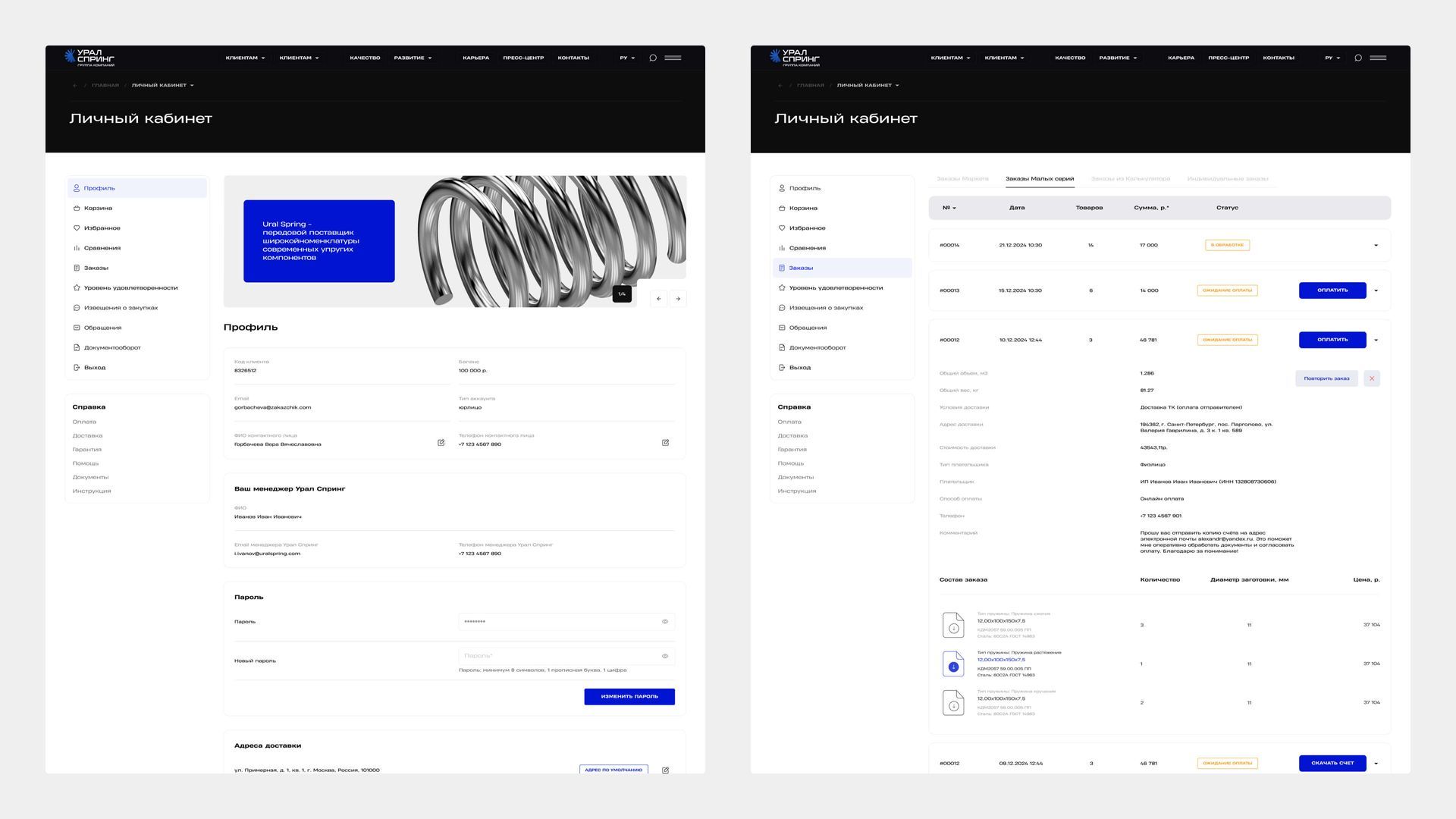
Building one path to inquire, order, or buy, not three separate systems
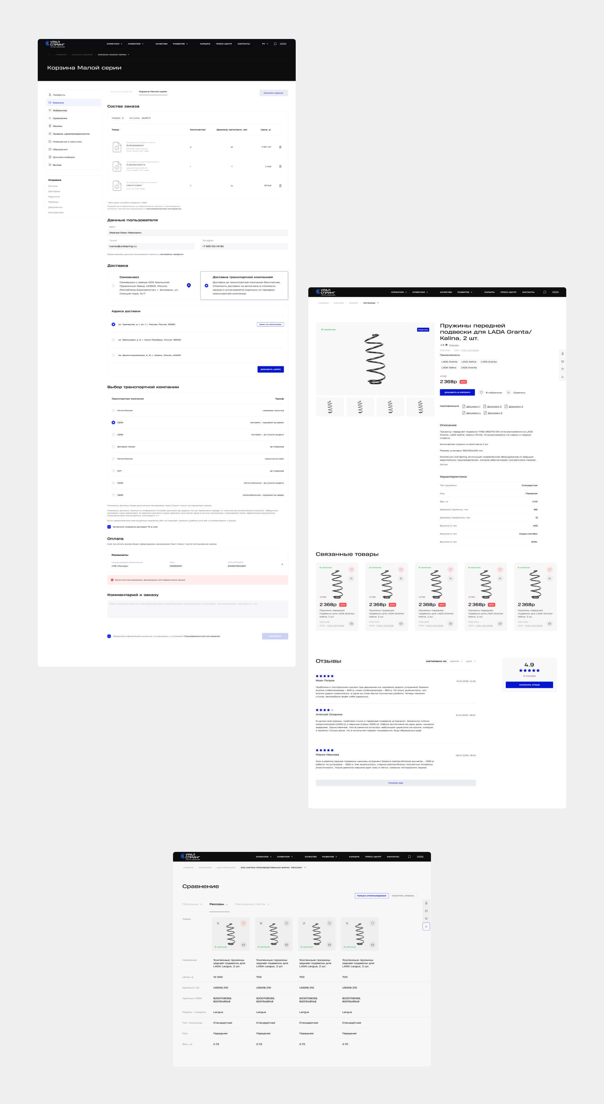
Where the old setup split a client's options by which domain they landed on, the new design routes every path — browsing the catalog, ordering through the marketplace, requesting a custom small-batch order, or submitting an individual order with drawings — through one system, built around a single personal account that covers all of them: orders, saved addresses, favorites, and support requests in one place.
That account layer didn't exist anywhere in the old setup. Designing it meant specifying real states a returning client would actually hit — an item out of stock, an order awaiting payment, a saved address to edit — not just the ideal first-time path, since a build this size can't rely on a developer inferring what happens when something isn't the happy path.
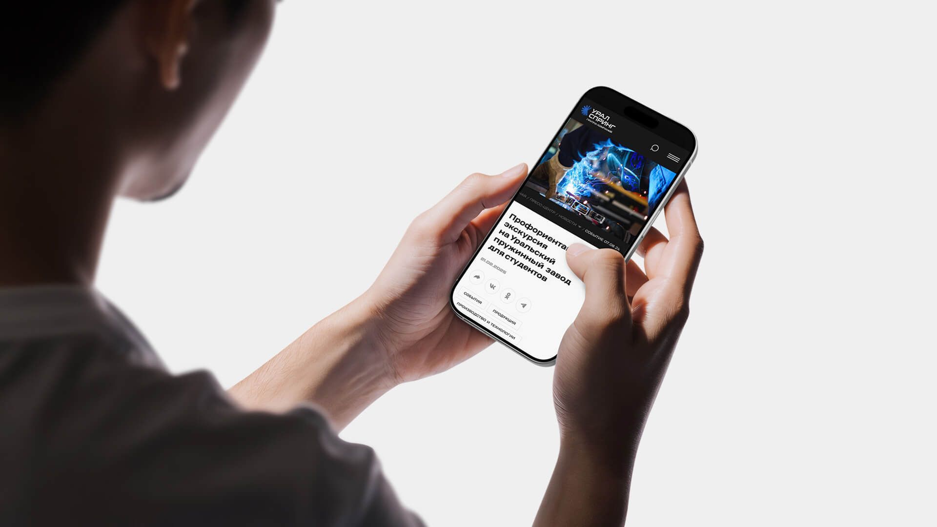
Blog page mobile version
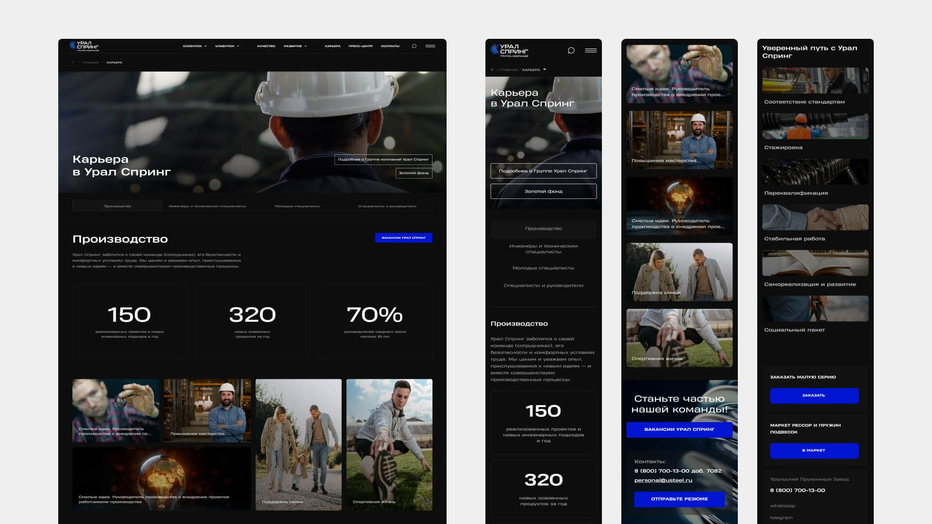
Careers page
Careers page
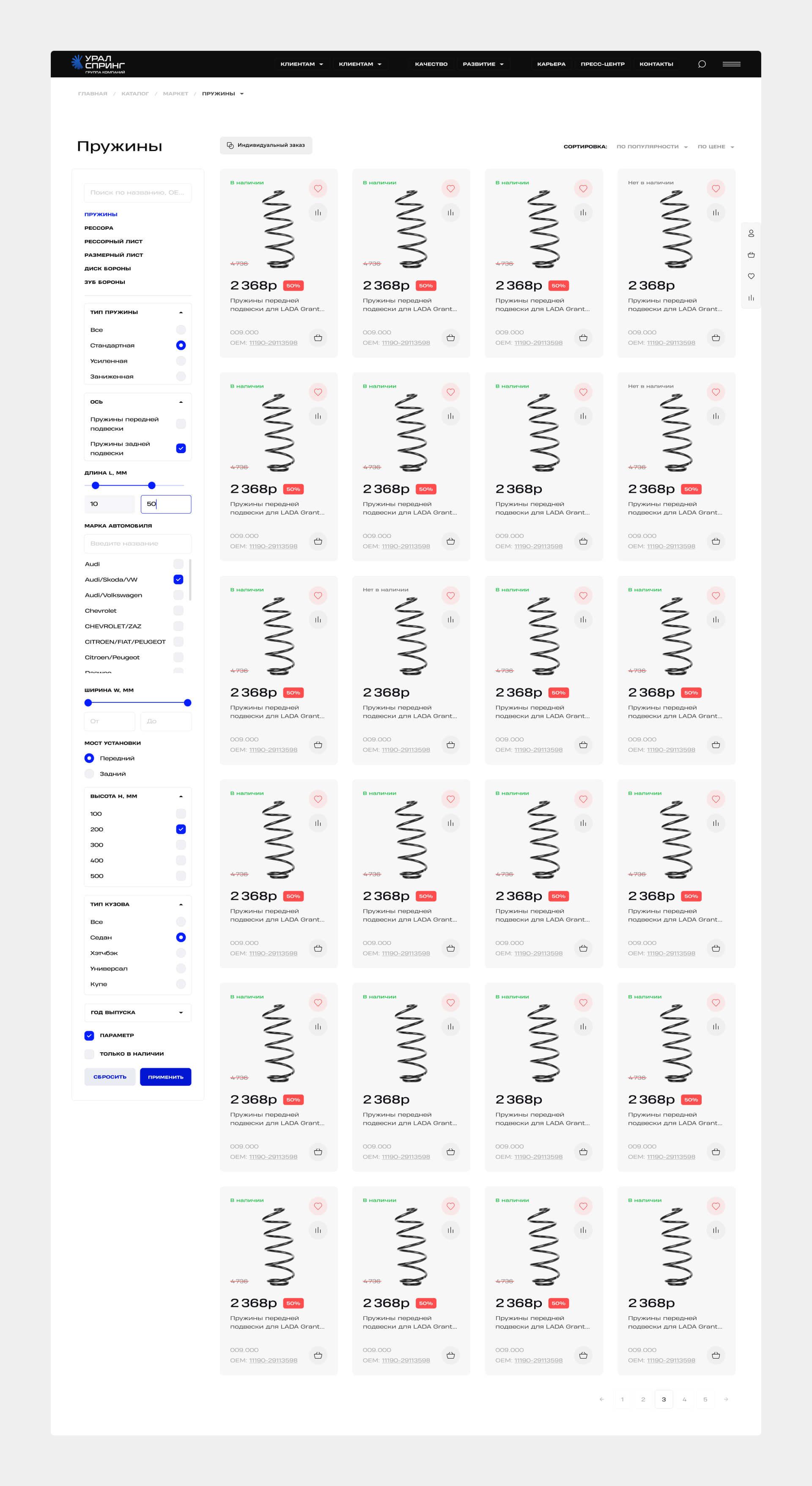
Extending one design system across the whole catalog, not restyling page by page
Rather than designing each new section as its own visual exercise, the build stayed inside the site's existing design system throughout — new components and page layouts were built to extend that system, not sit apart from it, even for the most complex and deeply nested elements the new sections needed.
The scale shows in the reuse: 3,700+ component instances across the file, drawn from a system built to hold up across an entire industrial catalog, not just a handful of templates.
That discipline had a second dimension beyond consistency: staying conservative enough for a serious, technical B2B audience — engineers, procurement, dealers — while still making the site feel current rather than dated, a balance that shaped nearly every visual decision across the file.
product catalog with advanced filtering
Card, order details & comparison pages
Card, order details & comparison pages
Key Takeaways
01
Scaling a design system to a genuinely large component library is its own skill
It's a different discipline from designing any single screen well — the system has to hold up under reuse across hundreds of variations without drifting or duplicating logic.
02
A serious, traditional industry calls for a different kind of restraint
Staying conservative enough to read as credible to an industrial, technical audience — while still making the site feel current rather than dated — meant deliberately dialing back some choices that would work fine in a more consumer-facing project.
03
Usability matters more, not less, when the audience is professional
Designing for engineers, procurement teams, and dealers meant treating clear, functional UX as the priority throughout the project, ahead of any purely visual flourish.
Let’s do this
Whether you're hiring or you've got a project, get in touch.
You didn't land here by accident. Whatever brought you, get in touch and let's figure out the next step.